Crafting an interactive UX dashboard for CAF

I drove the end-to-end user experience and visual architecture for CAF (Development Bank of Latin America and the Caribbean), transforming complex data into an intuitive, interactive executive summary dashboard tailored for web integration.
The project involved conceptualizing, diagramming, and crafting ten bespoke data visualizations, thoughtfully aligned with the client’s brand guidelines and key visual system to ensure seamless user engagement and information clarity.
Through a structured layout and prototyping workflow in Canva, the initiative culminated in the technical deployment and final export of the dashboard as a responsive, embeddable web page.
The project reinforces CAF‘s digital communication tools, making institutional insights highly accessible and engaging for diverse stakeholders.


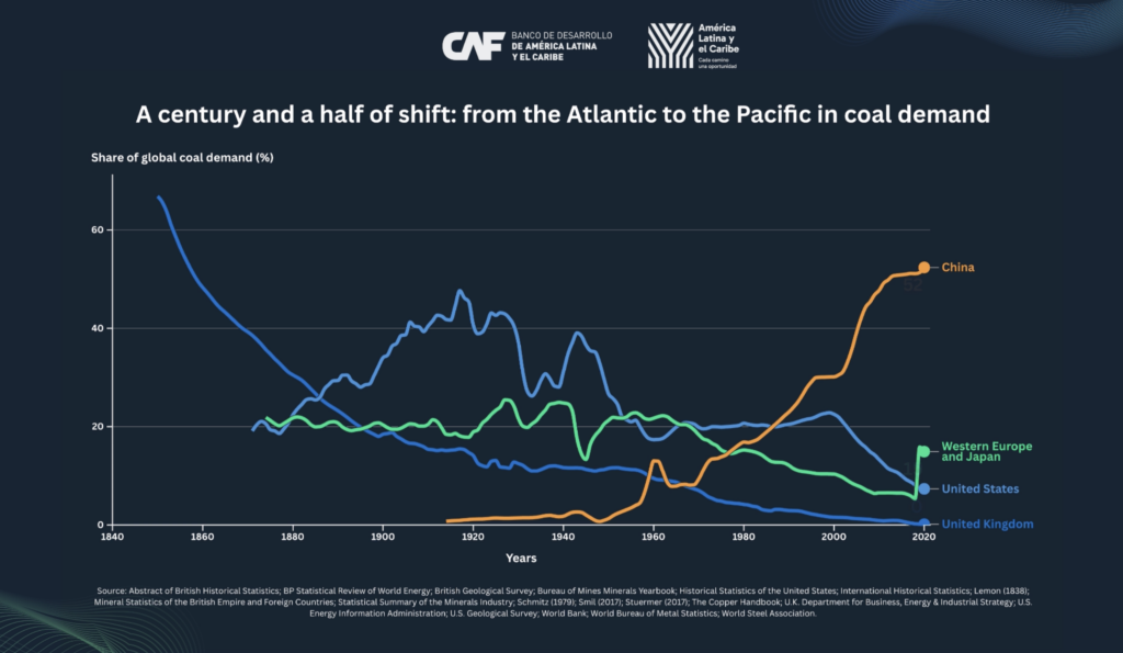
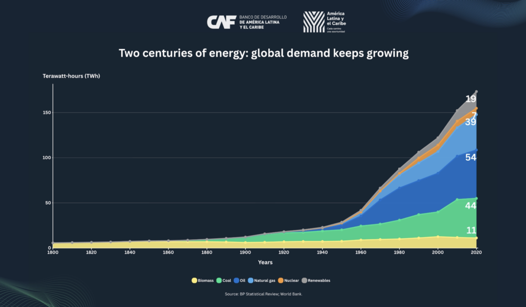
Result
Ten bespoke data visualizations aligned with CAF's brand system, deployed as a responsive, embeddable web page.